INTGR 1665 Image in Context
Course Description: Image in Context is a Foundation course based in interdisciplinary practice. The course investigates both the image — whether found, captured, created, or manipulated — and its various contexts inclusive of fine arts, pop culture, sub-culture and/or specifically designed for purely communicative purposes. This is a studio course intended to introduce students to fundamental image making establishing the basic formal elements by practice. Through assignments and projects, students will address the following questions: How do images/objects function in our society? How do they accumulate and accrue meaning? How is our understanding of an image shaped by its context? How do different technologies mediate our engagement with images/objects? How do artists and designers use and think about “imagery” in their work? Students should see this course as a way to introduce and articulate their ideas through the work that they make and the imagery they archive.
Public Archive Project (Group Assignment)
As Coal Burns, Ice Melts. Arielle Schenkman, Lucia Kolk, Joshua Hayes, Lee
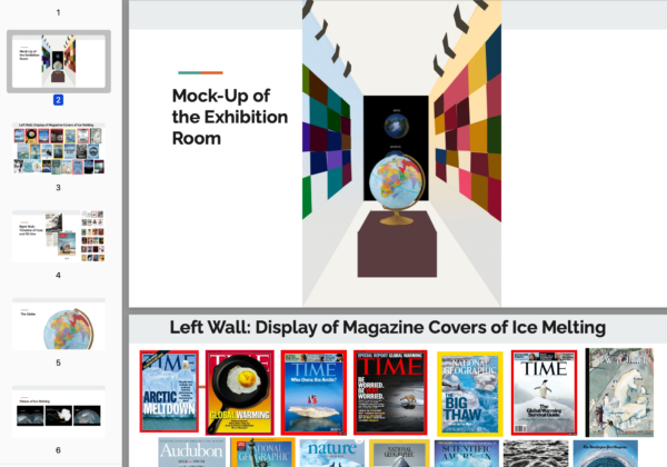
This project is an artistic take on the very real problem of global warming. Our group narrowed down our topic to the idea of the polar ice caps melting and how our actions are the cause of it. We have a theme of chronology included since the effects of global warming only increase as time goes on. For our exhibition, you would enter a contained room with three different walls and a globe in the middle. There would be audio playing of ice cracking and shifting. The first wall you see is the one across from you. Projected onto it are videos of what both the Arctic and Antarctic ice caps have looked like overtime and today. This wall is in between the two walls of the two different timelines showing what is currently happening because of this juxtaposition. Turning to the left you would see a collage of magazines displaying the growing crisis of global warming causing the polar ice caps to melt. A cool- blue light shines on this wall to represent the cold of ice. Turning to the right, are the events occurring at the same time of these magazines. A chronology of newspapers and magazine covers displaying coal and oil usage which influence global warming. This timeline is to show how coal and oil were popularized and recommended for use. However, as time has gone on magazines started to show how coal and oil use have become threatening to the environment. The warming is also represented by warm yellow lights shining on the wall. Finally, directly in front of you is a slowly turning globe. The countries that use the most oil and coal which influences the polar ice caps melting are highlighted in red. The timelines show how there were warnings all along, but our behavior is not changing.
Artist Book Assignment
The Eyes of a Child. YelitseI Servellon
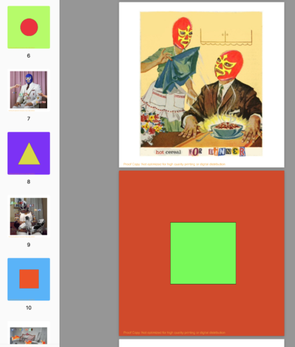
“I was inspired to make the book from a similar book I made when I was younger. Making it the world in the eyes of a child. The book is something between a diary and a scrapbook. Viewing how the child sees her world and how she describes it anyway, she can with the cutout magazines letters. Changing her parent’s heads to have Lucha libre masks because, at an early age, you view your parents as the center of your universe, almost like these superheroes protecting you. With this supposed perfect nuclear family playing out. A stay-at-home mom feeling suffocated by an overbearing mother-in-law and a cheating, neglectful husband. Just only wanting to escape all of that. The husband, who’s supposed to be the breadwinner, neglects them and runs off to other women that the girl knows about. Some pictures sometimes show the girl as a mother figure to her siblings, still being a child herself. But by showing the playful aspect in a sometimes bleak and dark world. The simplicity of how the child is still viewing the world in these fun shapes and colors.”

What Might Have; What Could Have; What Should Have. Justine Cantor
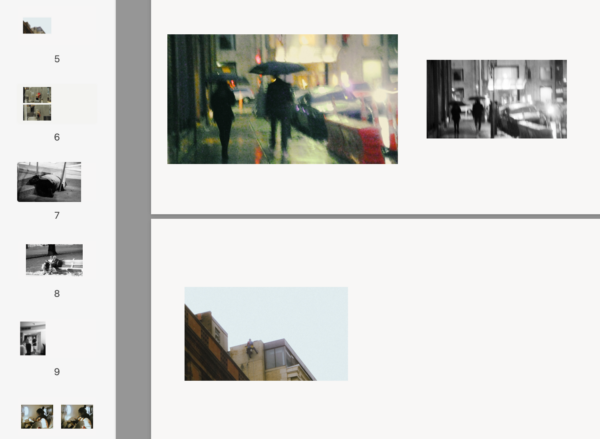
“In the chaos of our daily lives, we often find ourselves moving through a world brimming with stories, yet all too frequently, we remain oblivious to their existence. We are perpetual observers of life fragments, catching mere glimpses of the strangers—the person waiting at the traffic light, the solitary individual sipping coffee by the café window, or the restless souls in the subway car on our way to work—each one a fleeting character in our own lives. These images invite us to reflect on the hidden narratives that dwell within the everyday– snippets of someone’s existence, an affirmation that we are alive. They serve as visual echoes, a reminder that there is an abundance of stories that surrounds us. Our minds are private realms where personal stories, aspirations, and fears take shape. The moments of joy, despair, the whispered hopes, and silent struggles—we carry them with us, often hidden from the sight of others. This body of work urges us to explore these inner narratives, to recognize that the stories that live in our heads are as significant as any other. This collection of images and handwritten stories is an enticement to peer beyond the surface of existence, to engage in the act of seeing, truly seeing, the lives of strangers and the stories they hold.”
This hardcover book includes handwritten post-it notes (not seen in digital version) addressing some of the questions that book title proposes. It also includes blank post-it notes for the viewer to write on and affix to the book pages.
Privilege of Portraiture. Lucia Kolk
“My artist book assignment is about the way portrait photography has transformed since 1839, when Robert Cornelius shot the first self-portrait. Due to the cost of having a portrait done at that time, the wealthy were the only people getting them done. After some years, more people took part in daguerreotype photography. As a result, it lessened in cost and value, and more people were able to have portraits done. It became more candid as the years went on and less about keeping everything still thanks to further photography technology. I compiled photographs from different years to show the way in which photography has changed. I wanted to show the contrast between older portrait photographs, that are without color and calculated, to newer, which are mostly in color and candid. Now, it is much easier to take portraits and photographs with access to a cell phone. This does take way from the special nature that portraits used to have but makes it more widely available. I used a dictionary because I’d like to think about the way the history of words has changed, and the way photography has changed over the years. I sewed in pages and painted them black in order to keep the focus on the photos inside the book. I spread out the photos in a way that lets the viewer see all different eras of photography on each page and not just one era of photography a page. I chose to do this because I’d like the viewer to notice similarities and differences on every page instead of going back to look each time.”
New Message. Marlena Hite
“New Message, shaped and painted in a juvenile craft style to resemble a pink flip phone, features various text messages from flip phones. The images are ordered to loosely outline the failure of a relationship with texts from multiple parties, including the owner of the phone. I feel that the juxtaposition of the exterior, being an out of date phone in a girly tween style, and the interior chronicling a declining relationship highlight the difficulty of growing up as a girl.”
Video Montage Assignment
“The Fight The Dance” Rory Fisher
My video montage project “The Fight The Dance” is clips from dancing and mix martial arts fighting. I chose to juxtapose these two topics with two different kinds of classical music. The intense music goes with the dance, while the soft and relaxing music goes with the fighting. I want to show how mixed martial arts is very similar to dance, it is acrobatic and beautiful just like dance. I want people to see that fighting is just as respectable as other sports.
“Meet Me in the Middle” Marlena Hite
My video montage is a compilation of various film clips over the song “Sister Golden Hair” by America, as inspired and added to the scene in “Miss Stevens”. (Almost) all of the film clips are set inside a car. I chose the setting to the the connecting thread between the clips because of it’s unique qualities. A car is extremely solitary from the outside world, but also a space of confinement for the passengers inside. The variety of clips cross this barrier between vehicles and joins the characters’ emotional journeys together in reference to the lyrics of the song and each other.
“Hidden Beauty” Nicole Craddock
At first, this assignment presented as a challenge for me. at first my idea was about a montage of different kinds of clothes I like and then later had the idea of combining the audio of all the fashion, tutorials and videos, on how to be a proper woman in society, with videos of modern women in the military, or putting on makeup how they want in general, just being badass. My goal was to show the fact that beauty and what is considered, feminine or proper, has definitely changed over centuries. Beauty can mean many different things for many people.


